
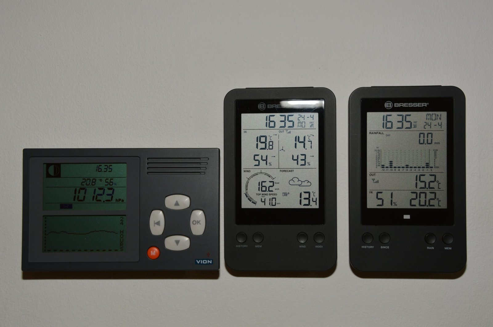
When a user walks up to an industrial control panel, a smart thermostat, or a medical ventilator, their expectation has already been set by the smartphone in their pocket. They expect fluid animations, instantaneous feedback, and an intuitive layout. However, as any embedded engineer or UI/UX designer working in the European and North American markets knows, designing a user interface for an embedded TFT touch display is a fundamentally different discipline than designing for iOS or Android.
You are not working with a multi-core gigahertz processor and gigabytes of RAM. You are often working with an STM32 or NXP microcontroller (MCU), limited flash memory, and an RGB565 color space. If you attempt to port a web-based UI directly onto a TFT touch display, the result will be sluggish, unresponsive, and visually broken.
This comprehensive, highly actionable guide breaks down the engineering realities and design psychology required to build a flawless, intuitive user interface specifically tailored for embedded TFT touch display hardware.
1. Hardware Dictates Software: The Embedded Reality Check
Before you open Figma, Adobe XD, or Sketch, you must understand the physical and computational constraints of your hardware. A brilliant UI design is useless if the MCU cannot render it at 30 Frames Per Second (FPS).
MCU vs. MPU Constraints
- MCU (Microcontroller Unit): If your TFT touch display is driven by an MCU (e.g., via SPI or an 8080 parallel interface), you do not have a dedicated GPU. Every pixel transition, alpha blending (transparency), and anti-aliased font requires the CPU to calculate the math.
- The UI Rule: Avoid full-screen animations, complex gradients, and overlapping transparent layers. Use flat design, solid colors, and sprite-based animations.
- MPU (Microprocessor Unit): If your display is driven by a Linux-based MPU (e.g., Raspberry Pi Compute Module, NXP i.MX) via MIPI DSI or HDMI, you have hardware acceleration.
- The UI Rule: You can implement fluid transitions, drop shadows, and vector graphics, but you must still optimize asset sizes to ensure fast boot times.
Resistive vs. PCAP Touch Limitations
The type of touch panel integrated into your TFT touch display entirely dictates your interaction design:
- Capacitiva Projetada (PCAP): Supports multi-touch and light swipes (like a smartphone). You can use pinch-to-zoom and swipe-to-scroll gestures.
- Resistiva: Requires physical pressure to register a touch. It is single-touch only. Do not use swipe gestures on a resistive screen. If a user tries to “swipe” a resistive screen, their finger will drag and skip, resulting in a terrible experience. Rely exclusively on clearly defined “Tap” buttons (Up/Down arrows) for navigation.
2. The Geometry of Interaction: Sizing, Spacing, and Ergonomics
In an industrial or medical setting, users are often stressed, distracted, or wearing personal protective equipment (PPE). Your UI must accommodate the “Fat Finger Problem” and adhere to ergonomic standards (such as ISO 9241-11 and ADA guidelines).
Touch Target Sizing (Fitts’s Law)
Fitts’s Law states that the time required to rapidly move to a target area is a function of the ratio between the distance to the target and the width of the target. Make your buttons big.
- Bare Hands (Consumer/Smart Home): The absolute minimum touch target size should be 9mm x 9mm (roughly 48×48 pixels on a standard 100-150 PPI display).
- Gloved Hands (Industrial/Medical): If the operator is wearing nitrile or heavy leather work gloves, buttons must be increased to a minimum of 15mm x 15mm to prevent accidental misclicks.
Spacing and “Dead Zones”
Do not pack buttons tightly together. Leave a minimum of 2mm to 3mm of dead space between interactive elements. Furthermore, avoid placing critical action buttons (like “Emergency Stop” or “Format Drive”) in the extreme corners of the TFT touch display. The extreme edges of standard PCAP and resistive touch panels are often the least sensitive areas due to the bezel overlay and sensor routing. Place critical buttons slightly inset from the bezel.
3. Visual Hierarchies and Color Psychology
An embedded TFT touch display does not have the OLED-level contrast ratios of a modern iPhone. You must design your color palette defensively to compensate for the hardware’s optical characteristics.
The RGB565 Limitation
Many embedded TFT displays use a 16-bit color format (RGB565) rather than 24-bit True Color (RGB888) to save RAM. RGB565 allows for 65,536 colors.
- The Problem: Subtle gradients will exhibit severe “color banding” (harsh, visible lines between color transitions).
- A Solução: Use flat UI design. If you must use gradients, apply a “dithering” effect to the image asset before loading it into your UI framework.
Contrast Ratios and Glare
If your device is used outdoors or in a brightly lit factory floor, glare will wash out subtle color differences.
- Avoid Low-Contrast Text: Gray text on a dark gray background looks sleek on your MacBook, but it will be entirely illegible on a 350-nit TFT panel under fluorescent lighting. Adhere to the WCAG 2.1 AA standard, which requires a contrast ratio of at least 4.5:1 for normal text and 3:1 for large text.
- True Black vs. Dark Gray: LCDs rely on a backlight. “Pure black” (#000000) on a TFT panel often looks like a glowing, washed-out dark gray in a dim room. Instead of pure black, use a rich dark blue or charcoal gray (#121212) for your backgrounds. It hides the backlight bleed and makes the UI look more premium.
Typographic Clarity
Embedded fonts are usually pre-rendered bitmaps to save processing power.
- Avoid thin, elegant serif fonts. They will look pixelated and broken on a 1024×600 resolution TFT touch display.
- Use robust, sans-serif fonts (like Roboto, Open Sans, or Inter). Keep font weights at “Regular” or “Bold.”
4. Compensating for Hardware Lag: The Illusion of Speed
Even with a well-optimized UI, an MCU-driven TFT touch display might take 100 to 300 milliseconds to load a new screen or process a complex command. To the human brain, anything over 100ms feels like “lag.” You must design the UI to mask this delay.
The Critical Role of State Changes
When a user presses a button on a smartphone, the haptic motor buzzes instantly. Your TFT touch display likely does not have a haptic motor. Therefore, you must provide instantaneous visual feedback.
- Pressed States: Every button must have a distinct “Pressed” state (e.g., the button turns a darker shade, or the shadow disappears to make it look “pushed in”). This state change must happen the millisecond the touch interrupt is triggered, antes de o MCU começar a processar o comando real.
- Feedback Auditivo: Se o seu hardware incluir um buzzer piezoelétrico, programe um “clique” curto e nítido de 20ms para cada toque válido. Esta confirmação auditiva reduz drasticamente a frustração do utilizador.
Indicadores de Carregamento
Se uma transição demorar mais de 300ms (ex.: guardar dados num cartão SD ou obter redes Wi-Fi), não deixe o ecrã congelado. O utilizador pensará que o dispositivo bloqueou e começará a tocar freneticamente no ecrã.
- Exiba imediatamente um sprite rotativo simples e de baixo consumo ou um ícone de ampulheta.
5. Arquitetura de Navegação: Achatar a Curva
Em ambientes industriais e profissionais, os utilizadores estão a executar tarefas, não a navegar casualmente. A carga cognitiva necessária para operar o seu dispositivo deve ser próxima de zero.
A Regra dos “Três Toques”
Um utilizador deve conseguir aceder a qualquer função crítica com três toques a partir do ecrã principal. Não esconda controlos essenciais da máquina em menus profundos e aninhados.
Navegação Persistente
Ao contrário de uma aplicação de smartphone que usa gestos de deslizar para voltar, uma interface de utilizador TFT incorporada deve apresentar sempre uma barra de navegação persistente (normalmente na parte superior ou inferior do ecrã).
- Inclua sempre um botão “Início” altamente visível.
- Inclua sempre um botão “Voltar”.
- Use iconografia padrão e universalmente reconhecida (uma engrenagem para definições, uma casa para o painel principal). Não invente ícones personalizados para funções padrão; os utilizadores não têm tempo para aprender a sua linguagem visual proprietária.
6. Prototipagem e Implementação: A Stack Tecnológica
Colmatar o fosso entre o ficheiro Figma do designer de UI e o código C++ do engenheiro de sistemas embebidos é historicamente a parte mais dolorosa do desenvolvimento de ecrãs TFT tácteis. Felizmente, os frameworks GUI modernos revolucionaram este fluxo de trabalho.
Se está a desenvolver para os mercados europeu ou norte-americano, deve utilizar um dos seguintes frameworks padrão da indústria:
- TouchGFX (da STMicroelectronics): Se está a usar um MCU STM32, este é o padrão de excelência. Inclui um designer WYSIWYG (What You See Is What You Get) que gera automaticamente código C++ altamente otimizado. É especificamente construído para extrair 60 FPS de hardware com recursos limitados.
- LVGL (Light and Versatile Graphics Library): Uma biblioteca C de código aberto incrivelmente poderosa. É independente do hardware, o que significa que pode executá-la em chips NXP, ESP32 ou STM32. É leve, mas requer um pouco mais de codificação manual do que o TouchGFX.
- Qt for MCUs / Qt Design Studio: Para dispositivos embebidos de alta gama (muitas vezes a executar Linux em MPUs), o Qt proporciona uma experiência de desenvolvimento semelhante à de um smartphone. É dispendioso, mas oferece o nível mais elevado de fidelidade gráfica e prototipagem rápida.
Conclusão: Empatia na Engenharia
Projetar uma UI intuitiva para um ecrã TFT tátil é um exercício de empatia em engenharia. Deve ter empatia com as limitações do hardware, garantindo que não sobrecarrega o MCU com elementos gráficos desnecessários. Mais importante ainda, deve ter empatia com o utilizador final, que pode estar a operar o seu dispositivo num ambiente de alto stress, com pouca luz ou de ritmo acelerado.
Ao aderir estritamente a áreas tácteis ergonómicas, utilizando princípios de design plano para mascarar as restrições de hardware e fornecendo feedback visual instantâneo, eleva o seu produto de uma mera máquina funcional para uma ferramenta profissional e premium.
Perguntas frequentes (FAQ)
P: Concebemos uma UI bonita, mas o ecrã cintila violentamente quando transitamos entre páginas. Como corrigimos isto? R: Isto chama-se “tearing”. Acontece quando o MCU atualiza o buffer de exibição enquanto o controlador TFT está no meio do desenho do ecrã. Deve implementar Double Buffering. Isto requer a alocação de RAM suficiente para conter dois framebuffers completos. O MCU desenha o próximo ecrã inteiramente no buffer de fundo e, em seguida, troca-o para o ecrã ativo apenas durante o período de VSYNC (Sincronização Vertical).
P: Podemos usar imagens PNG ou JPEG na nossa UI embebida? R: Geralmente, não. A descodificação de formatos de imagem comprimidos como PNG ou JPEG requer uma enorme sobrecarga da CPU e demora demasiado tempo num MCU. Os frameworks de UI (como TouchGFX ou LVGL) converterão os seus PNGs em arrays C brutos (bitmaps) durante o processo de compilação. A contrapartida é que os bitmaps brutos ocupam significativamente mais espaço na memória flash.
P: O nosso ecrã tátil PCAP regista toques fantasmas quando gotas de água o atingem. A UI pode corrigir isto? R: O software só pode fazer até certo ponto para filtrar ruído capacitivo. Embora possa implementar algoritmos de “debounce” no código do controlador tátil para ignorar entradas erráticas e ultra-rápidas, a correção verdadeira é baseada em hardware. Precisa de ajustar o firmware do IC do controlador tátil (ex.: Goodix, FocalTech) para reconhecer a assinatura de capacitância da água versus um dedo humano, ou mudar para um ecrã tátil resistivo se o dispositivo estiver constantemente molhado.
P: Porque é que as minhas fontes personalizadas aparecem serrilhadas e pixeladas no ecrã TFT? R: Os TFTs embebidos carecem do anti-aliasing avançado de sub-píxeis encontrado em sistemas operativos de desktop. Para corrigir isto, certifique-se de que o seu framework de UI está configurado para gerar fontes com anti-aliasing de 4 bits por píxel (4bpp). Isto suavizará as bordas ao adicionar píxeis semi-transparentes em torno das letras. Além disso, opte por fontes sans-serif em negrito, que naturalmente têm melhor renderização em ecrãs de baixa resolução.
P: Como projetamos para utilizadores daltónicos num ambiente industrial? R: Nunca dependa apenas da cor para transmitir informações críticas. Se o estado de uma máquina mudar para “Erro”, não mude simplesmente um indicador de estado de verde para vermelho. Altere também a forma (ex.: de um círculo verde para um triângulo vermelho) e adicione texto explícito (ex.: “FALHA”). Isto garante conformidade com a ADA (Americans with Disabilities Act) e assegura a segurança, independentemente da acuidade visual do utilizador.


