인터페이스 엔지니어링: TFT 터치 디스플레이를 위한 직관적 UI 설계 실용 가이드
When a user walks up to an industrial control panel, a smart thermostat, or a medical ventilator, their expectation has already been set by the smartphone in their pocket. They expect fluid animations, instantaneous feedback, and an intuitive layout. However, as any embedded engineer or UI/UX designer working in the European and North American markets knows, designing a user interface for an embedded TFT touch display is a fundamentally different discipline than designing for iOS or Android.
You are not working with a multi-core gigahertz processor and gigabytes of RAM. You are often working with an STM32 or NXP microcontroller (MCU), limited flash memory, and an RGB565 color space. If you attempt to port a web-based UI directly onto a TFT touch display, the result will be sluggish, unresponsive, and visually broken.
This comprehensive, highly actionable guide breaks down the engineering realities and design psychology required to build a flawless, intuitive user interface specifically tailored for embedded TFT touch display hardware.
1. Hardware Dictates Software: The Embedded Reality Check
Before you open Figma, Adobe XD, or Sketch, you must understand the physical and computational constraints of your hardware. A brilliant UI design is useless if the MCU cannot render it at 30 Frames Per Second (FPS).
MCU vs. MPU Constraints
- MCU (Microcontroller Unit): If your TFT touch display is driven by an MCU (e.g., via SPI or an 8080 parallel interface), you do not have a dedicated GPU. Every pixel transition, alpha blending (transparency), and anti-aliased font requires the CPU to calculate the math.
- The UI Rule: Avoid full-screen animations, complex gradients, and overlapping transparent layers. Use flat design, solid colors, and sprite-based animations.
- MPU (Microprocessor Unit): If your display is driven by a Linux-based MPU (e.g., Raspberry Pi Compute Module, NXP i.MX) via MIPI DSI or HDMI, you have hardware acceleration.
- The UI Rule: You can implement fluid transitions, drop shadows, and vector graphics, but you must still optimize asset sizes to ensure fast boot times.
Resistive vs. PCAP Touch Limitations
The type of touch panel integrated into your TFT touch display entirely dictates your interaction design:
- 투영 정전용량식(PCAP): Supports multi-touch and light swipes (like a smartphone). You can use pinch-to-zoom and swipe-to-scroll gestures.
- 저항막식: Requires physical pressure to register a touch. It is single-touch only. Do not use swipe gestures on a resistive screen. If a user tries to “swipe” a resistive screen, their finger will drag and skip, resulting in a terrible experience. Rely exclusively on clearly defined “Tap” buttons (Up/Down arrows) for navigation.
2. The Geometry of Interaction: Sizing, Spacing, and Ergonomics
In an industrial or medical setting, users are often stressed, distracted, or wearing personal protective equipment (PPE). Your UI must accommodate the “Fat Finger Problem” and adhere to ergonomic standards (such as ISO 9241-11 and ADA guidelines).
Touch Target Sizing (Fitts’s Law)
Fitts’s Law states that the time required to rapidly move to a target area is a function of the ratio between the distance to the target and the width of the target. Make your buttons big.
- Bare Hands (Consumer/Smart Home): The absolute minimum touch target size should be 9mm x 9mm (roughly 48×48 pixels on a standard 100-150 PPI display).
- Gloved Hands (Industrial/Medical): If the operator is wearing nitrile or heavy leather work gloves, buttons must be increased to a minimum of 15mm x 15mm to prevent accidental misclicks.
Spacing and “Dead Zones”
Do not pack buttons tightly together. Leave a minimum of 2mm to 3mm of dead space between interactive elements. Furthermore, avoid placing critical action buttons (like “Emergency Stop” or “Format Drive”) in the extreme corners of the TFT touch display. The extreme edges of standard PCAP and resistive touch panels are often the least sensitive areas due to the bezel overlay and sensor routing. Place critical buttons slightly inset from the bezel.
3. Visual Hierarchies and Color Psychology
An embedded TFT touch display does not have the OLED-level contrast ratios of a modern iPhone. You must design your color palette defensively to compensate for the hardware’s optical characteristics.
The RGB565 Limitation
Many embedded TFT displays use a 16-bit color format (RGB565) rather than 24-bit True Color (RGB888) to save RAM. RGB565 allows for 65,536 colors.
- The Problem: Subtle gradients will exhibit severe “color banding” (harsh, visible lines between color transitions).
- 해결책: Use flat UI design. If you must use gradients, apply a “dithering” effect to the image asset before loading it into your UI framework.
Contrast Ratios and Glare
If your device is used outdoors or in a brightly lit factory floor, glare will wash out subtle color differences.
- Avoid Low-Contrast Text: Gray text on a dark gray background looks sleek on your MacBook, but it will be entirely illegible on a 350-nit TFT panel under fluorescent lighting. Adhere to the WCAG 2.1 AA standard, which requires a contrast ratio of at least 4.5:1 for normal text and 3:1 for large text.
- True Black vs. Dark Gray: LCDs rely on a backlight. “Pure black” (#000000) on a TFT panel often looks like a glowing, washed-out dark gray in a dim room. Instead of pure black, use a rich dark blue or charcoal gray (#121212) for your backgrounds. It hides the backlight bleed and makes the UI look more premium.
Typographic Clarity
Embedded fonts are usually pre-rendered bitmaps to save processing power.
- Avoid thin, elegant serif fonts. They will look pixelated and broken on a 1024×600 resolution TFT touch display.
- 견고한 산세리프 폰트(Roboto, Open Sans, Inter 등)를 사용하십시오. 폰트 두께는 “Regular” 또는 “Bold”로 유지하십시오.”
4. Compensating for Hardware Lag: The Illusion of Speed
UI가 잘 최적화되어 있더라도, MCU 기반 TFT 터치 디스플레이가 새 화면을 로드하거나 복잡한 명령을 처리하는 데 100~300밀리초가 소요될 수 있습니다. 인간의 뇌는 100ms 이상의 지연을 “렉(lag)”으로 인식합니다. 이러한 지연을 가릴 수 있도록 UI를 설계해야 합니다.
The Critical Role of State Changes
사용자가 스마트폰에서 버튼을 누르면 햅틱 모터가 즉시 진동합니다. 하지만 TFT 터치 디스플레이에는 일반적으로 햅틱 모터가 없습니다. 따라서 즉각적인 피드백을 제공해야 합니다. 시각적 피드백.
- 눌림 상태: 모든 버튼은 명확한 “눌림” 상태(예: 버튼이 더 어두운 색으로 변하거나 그림자가 사라져 “눌려 들어간” 것처럼 보이게)를 가져야 합니다. 이 상태 변화는 터치 인터럽트가 트리거되는 순간, MCU가 실제 명령 처리를 시작하기 전에 발생해야 합니다., 명령 처리 전에. 청각적 피드백:.
- 하드웨어에 압전 부저가 포함된 경우, 모든 유효한 터치 입력에 대해 짧고 선명한 20ms "클릭"음을 프로그래밍하십시오. 이 청각적 확인은 사용자 불만을 극적으로 줄여줍니다. 전환(예: SD 카드에 데이터 저장 또는 Wi-Fi 네트워크 검색)이 300ms 이상 소요될 경우, 화면을 정지 상태로 두지 마십시오. 사용자는 장치가 고장 났다고 생각하고 화면을 연타하기 시작할 것입니다.
Loading Indicators
즉시 간단하고 리소스 사용량이 적은 회전 스프라이트 또는 모래시계 아이콘을 표시하십시오.
- 산업 및 전문 환경에서 사용자는 작업을 수행 중이며, 캐주얼하게 탐색하는 것이 아닙니다. 장치를 작동하는 데 필요한 인지 부하(cognitive load)는 거의 0에 가까워야 합니다.
5. Navigational Architecture: Flatten the Curve
"세 번 터치" 규칙.
사용자는 홈 화면에서 세 번의 터치 내에 모든 중요 기능에 도달할 수 있어야 합니다. 필수적인 기계 제어 기능을 깊고 중첩된 메뉴에 숨기지 마십시오.
스와이프로 뒤로 가기 제스처를 사용하는 스마트폰 앱과 달리, 임베디드 TFT UI는 항상 지속적인 탐색 표시줄(보통 화면 상단 또는 하단)을 갖추어야 합니다.
Persistent Navigation
항상 눈에 잘 띄는 "홈" 버튼을 포함하십시오.
- 항상 “뒤로” 버튼을 포함하십시오.
- 표준적이고 보편적으로 인식되는 아이콘(설정은 톱니바퀴, 메인 대시보드는 집 모양)을 사용하십시오. 표준 기능에 대해 사용자 정의 아이콘을 발명하지 마십시오. 사용자가 독자적인 시각 언어를 배울 시간이 없습니다.
- UI 디자이너의 Figma 파일과 임베디드 엔지니어의 C++ 코드 간의 격차를 해소하는 것은 역사적으로 TFT 터치 디스플레이 개발에서 가장 고통스러운 부분이었습니다. 다행히도 현대 GUI 프레임워크는 이 워크플로우를 혁신적으로 변화시켰습니다.
6. Prototyping and Implementation: The Tech Stack
유럽 또는 미국 시장을 대상으로 개발하는 경우, 다음 업계 표준 프레임워크 중 하나를 활용해야 합니다:.
TouchGFX (STMicroelectronics):
- STM32 MCU를 사용하는 경우, 이것이 최고 표준입니다. WYSIWYG(What You See Is What You Get) 디자이너를 포함하여 고도로 최적화된 C++ 코드를 자동 생성합니다. 저사양 하드웨어에서 60FPS를 끌어내도록 특별히 설계되었습니다. LVGL:.
- 전문가용 스택: 매우 강력한 오픈 소스 C 라이브러리입니다. 하드웨어에 구애받지 않아 NXP, ESP32 또는 STM32 칩에서 실행할 수 있습니다. 가볍지만 TouchGFX보다 수동 코딩이 다소 필요합니다.
- Qt for MCUs / Qt Design Studio: 고급 임베디드 장치(종종 MPU에서 Linux 실행)의 경우, Qt는 스마트폰과 유사한 개발 경험을 제공합니다. 비용이 많이 들지만 최고 수준의 그래픽 충실도와 신속한 프로토타이핑을 제공합니다.
Conclusion: Empathy in Engineering
TFT 터치 디스플레이를 위한 직관적인 UI를 설계하는 것은 공학적 공감(engineering empathy)의 연습입니다. 하드웨어의 한계에 공감하여 불필요한 그래픽 부하로 MCU에 과부하를 주지 않도록 해야 합니다. 더 중요한 것은, 고스트레스, 조명이 어둡거나 빠른 속도의 환경에서 장치를 작동할 수 있는 최종 사용자에게 공감해야 한다는 점입니다.
인체공학적 터치 대상(target)을 엄격히 준수하고, 하드웨어 제약을 가리기 위해 플랫 디자인 원칙을 활용하며, 즉각적인 시각적 피드백을 제공함으로써, 제품을 단순한 기능적 기계에서 프리미엄 전문가용 도구로 끌어올릴 수 있습니다.
자주 묻는 질문(FAQ)
Q: 아름다운 UI를 설계했지만 페이지 전환 시 화면이 심하게 깜빡입니다. 어떻게 해결합니까? A: 이를 “테어링(tearing)”이라고 합니다. MCU가 TFT 컨트롤러가 화면을 그리는 중에 디스플레이 버퍼를 업데이트할 때 발생합니다. 이중 버퍼링(double buffering)을 구현해야 합니다. 버퍼 B:. 이를 위해 두 개의 전체 프레임버퍼를 저장할 충분한 RAM을 확보해야 합니다. MCU는 다음 화면을 백그라운드 버퍼에 완전히 그린 후, VSYNC(수직 동기화) 기간 동안에만 활성 디스플레이로 교체합니다.
Q: 임베디드 UI에서 PNG 또는 JPEG 이미지를 사용할 수 있습니까? A: 일반적으로 불가능합니다. PNG나 JPEG와 같은 압축 이미지 형식을 디코딩하려면 막대한 CPU 오버헤드가 필요하며 MCU에서 너무 오래 걸립니다. UI 프레임워크(TouchGFX 또는 LVGL 등)는 컴파일 과정에서 PNG를 원시 C-배열(비트맵)로 변환합니다. 단점은 원시 비트맵이 플래시 메모리 공간을 훨씬 더 많이 차지한다는 점입니다.
Q: PCAP 터치 스크린에 물방울이 떨어지면 유령 터치(phantom touch)가 발생합니다. UI로 이를 해결할 수 있습니까? A: 소프트웨어는 정전식 노이즈를 필터링하는 데 한계가 있습니다. 터치 컨트롤러 코드에 “디바운스(debounce)” 알고리즘을 구현하여 초고속, 불규칙한 입력을 무시할 수는 있지만, 진정한 해결책은 하드웨어 기반입니다. 터치 컨트롤러 IC(예: Goodix, FocalTech)의 펌웨어를 조정하여 물과 사람 손가락의 정전 용량 신호를 구별하거나, 장치가 지속적으로 젖는 환경이라면 저항막 방식 터치 스크린으로 전환해야 합니다.
Q: 사용자 정의 폰트가 TFT 디스플레이에서 톱니 모양으로 거칠게 보입니다. 이유는 무엇입니까? A: 임베디드 TFT는 데스크톱 운영 체제에서 볼 수 있는 고급 서브픽셀 안티앨리어싱이 부족합니다. 이를 해결하려면 UI 프레임워크가 4비트 픽셀당(4bpp) 안티앨리어싱으로 폰트를 생성하도록 설정해야 합니다. 4bpp 안티앨리어싱.. 이렇게 하면 문자 주위에 반투명 픽셀을 추가하여 가장자리를 부드럽게 만듭니다. 또한 저해상도 화면에서 자연스럽게 더 잘 렌더링되는 굵은 산세리프 폰트를 사용하십시오.
Q: 산업 환경에서 색맹 사용자를 위해 어떻게 설계합니까? A: 중요한 정보를 전달하는 데 색상에만 의존하지 마십시오. 기계 상태가 “오류”로 변경될 때 단순히 상태 표시기를 녹색에서 빨간색으로 바꾸지 마십시오. 대신 모양도 변경(예: 녹색 원에서 빨간색 삼각형으로)하고 명시적인 텍스트(예: “FAULT”)를 추가하십시오. 이는 ADA(미국 장애인법)를 준수하고 사용자의 시력에 관계없이 안전을 보장합니다.
디스플레이 프로젝트를 계획 중이신가요?
디스플레이 크기, 해상도, 인터페이스, 밝기, 터치 요구 사항, 컨트롤러 보드 요구 사항 및 적용 환경을 공유해 주십시오.
관련 자료
모든 기사 보기 →
관련 기술 문서
관련 디스플레이 기술 가이드 및 응용 참고 자료를 계속 읽어보십시오.


 LCD 디스플레이 선택 방법 4")
제품 경로
관련 디스플레이 모듈 및 솔루션
이 기사 주제와 관련된 제품 페이지를 탐색해 보십시오.
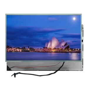
21.5인치 FHD 산업용 IPS LCD 디스플레이 모듈 - 300니트 밝기, 1920x1080 픽셀, 표준 LVDS 인터페이스
제품 보기 →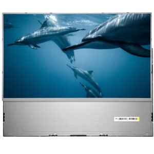
23.8인치 FHD 산업용 LCD 디스플레이 모듈 - 고대비 3000:1, 1920x1080 픽셀, 듀얼 채널 LVDS 인터페이스
제품 보기 →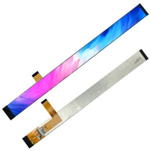
11.65인치 울트라 와이드 바 LCD 디스플레이 | 140x1920 해상도 | MIPI 인터페이스 | 전방위 시야각 지원 11.65" 스트레치 스트립 LCD 스크린
제품 보기 →